Simplifying talent assessment
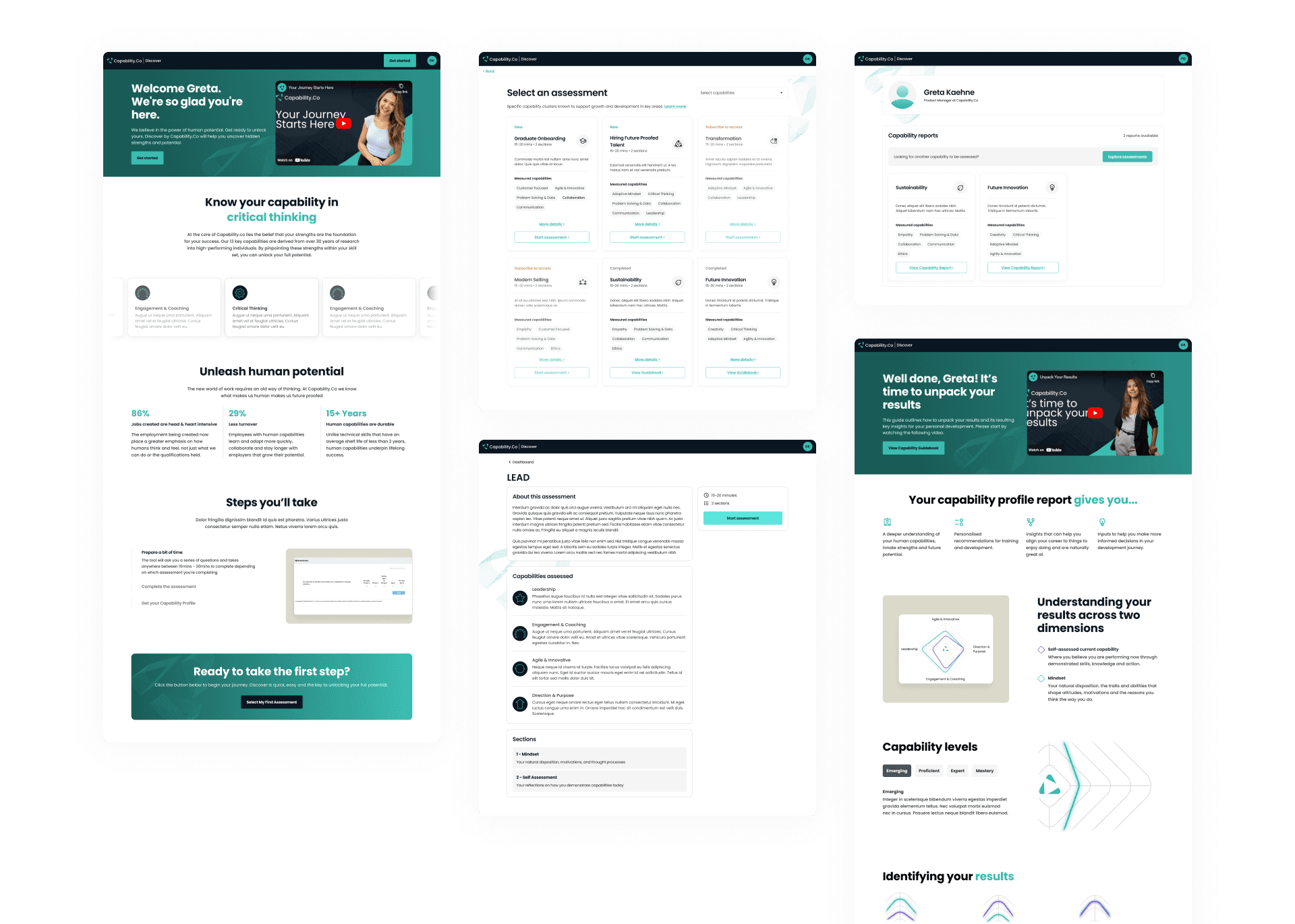
Capability.co is a talent assessment platform used by Australia's leading organisations including Telstra, ANZ, Stockland and My State Limited, to identify the strengths and mindsets of their workforce. With a growing number of clients, the team briefed me to create a more "welcoming" and "memorable" experience for the users of its assessment portal.
Team
UX Designer (Me)
Greta Kaehne (Product Manager)
Uri Levitsky (CTO)
Patrick Darcy (CEO)
Dave Fraser (Head of Marketing)
My responsibilities
Wireframing
Prototyping
Tools
Timeframe
Challenge
Users were unable to interpret their assessment outcomes
Capability.co employs an in-house "human development" research team to develop their assessment mechanisms. While the assessments and their outcomes were comprehensive, they were challenging to interpret by the assessment-takers, their team managers, and even within Capability.co.
Leveraging existing feedback from the team
My approach involved:
Trying out the assessment to have a hands-on feel
Learning key terms and mechanisms of the assessment
Collecting existing pain points and opportunities gathered by the Capability.Co team
Identifying opportunities to improve the experience for new returning users
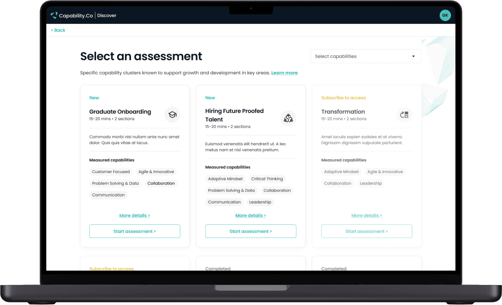
Creating prototypes for the user onboarding flow
Continuously iterating based on feedback from Capability.Co
Handover to senior developer for development
Increased confidence when pitching to executives and clients.
The redesigned user experience of assessment onboarding allowed the sales team to demonstrate the product more confidently to a wider range of potential users.


