Boosting lead conversion for affordable home deposit provider
Overview
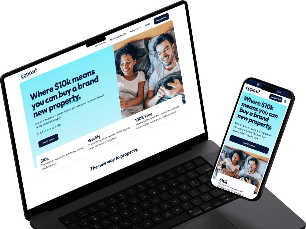
Coposit is changing the way people buy off-the-plan properties. Traditionally, a 10% deposit paid in a lump sum is needed to secure a property. With Coposit, only $10k is required upfront, followed by interest-free and fee-free weekly instalments paid weekly over the construction time.
In a campaign to help our audiences better understand the benefits of Coposit, I led a comprehensive redesign of the website, which has increased the quality of leads and conversion rates.
Team
UX/UI Designer (Me)
Product Manager
Web Developers
My activities
User research
Wireframing
Prototyping
Tools
Figma
Askable
Timeframe
10 weeks
Issues found from lead data
0 conversion to purchase
There was no known purchasers who were converted from enquiring on the Coposit website.
Knowledge gaps
Agents were unsatisfied with Coposit-generated leads which require a lot of time to explain what Coposit is, how it works, as well as key info such as bedroom configurations, which were difficult to do over call or email.
Spam enquiries
Numerous enquiries had fake email addresses, incomplete inquiries with no checkbox selections and empty messages. This was skewing the data and affecting the quality of genuine leads.
User research
Method
I interviewed 10 people who at the time recently browsed properties for sale on Realestate.com.au (REA) and/or Domain, which I've discovered from an earlier survey, are the top two property marketplaces used in Australia. The participants were recruited via Askable with screening questions such as their income range and the frequency of using the property marketplaces.
These 1 hour interviews were done as follows.
General Q & A (30 minutes)
Background and situation
Goals and barriers
Existing use cases of REA/Domain
Likes and pain points
Changes and additions desired
Coposit website testing (30 minutes)
Behavioral observation
Likes and pain points
Knowledge test about Coposit
Opinions about Coposit
Questions users have about Coposit
Insights
Behavioural observation indicated lack of education about Coposit
The homepgae lacked content that would engage users, such that they were all instantly drawn to the "Featured projects" section. Jumping straight to a featured project listing page, users lacked interest because only long descriptions of the project were available in the page, where they expected to find key points presented similarly to REA/Domain, but were missing.
They were also confused by the project enquiry form's irrelevant checkboxes such as "Request inspection" (as only display suites can be inspected and not the actual properties) and "Request callback" (as they realised unchecking didn't mean "do not call").
Misunderstandings due to lack of clarity
A significant number of participants had difficulty accurately describing Coposit’s value proposition and how it works, making it challenging for them to assess potential benefits and risks associated with using Coposit.
Some of the copies used, particularly in the section plainly highlighting the weekly Coposit payments of a property listing, also misled the participants' understandings, with majority believing it was simply another mortgage platform.
Trust issues due to lack of transparency
When given an explanation of Coposit, participants were concerned about the credibility of the platform as it would be a major liability to decide to use Coposit given the lack of transparency in the content provided to educate themselves.
Marketplace features seemed underwhelming
While users recognise Coposit's listing page as a property marketplace, the lack of listings and features they've been adapted to with REA/Domain made Coposit a hard sell for them to return, especially as they only understood it as merely another property marketplace or mortgage platform.
Usability issues due to inaccessible fonts
Users felt that some of the fonts were in the property list page were hard to read.
Common questions
The most frequently asked question was about the absence of interest or fees, which was a major barrier to trusting Coposit.
How might we improve clarity and transparency to earn more trust?
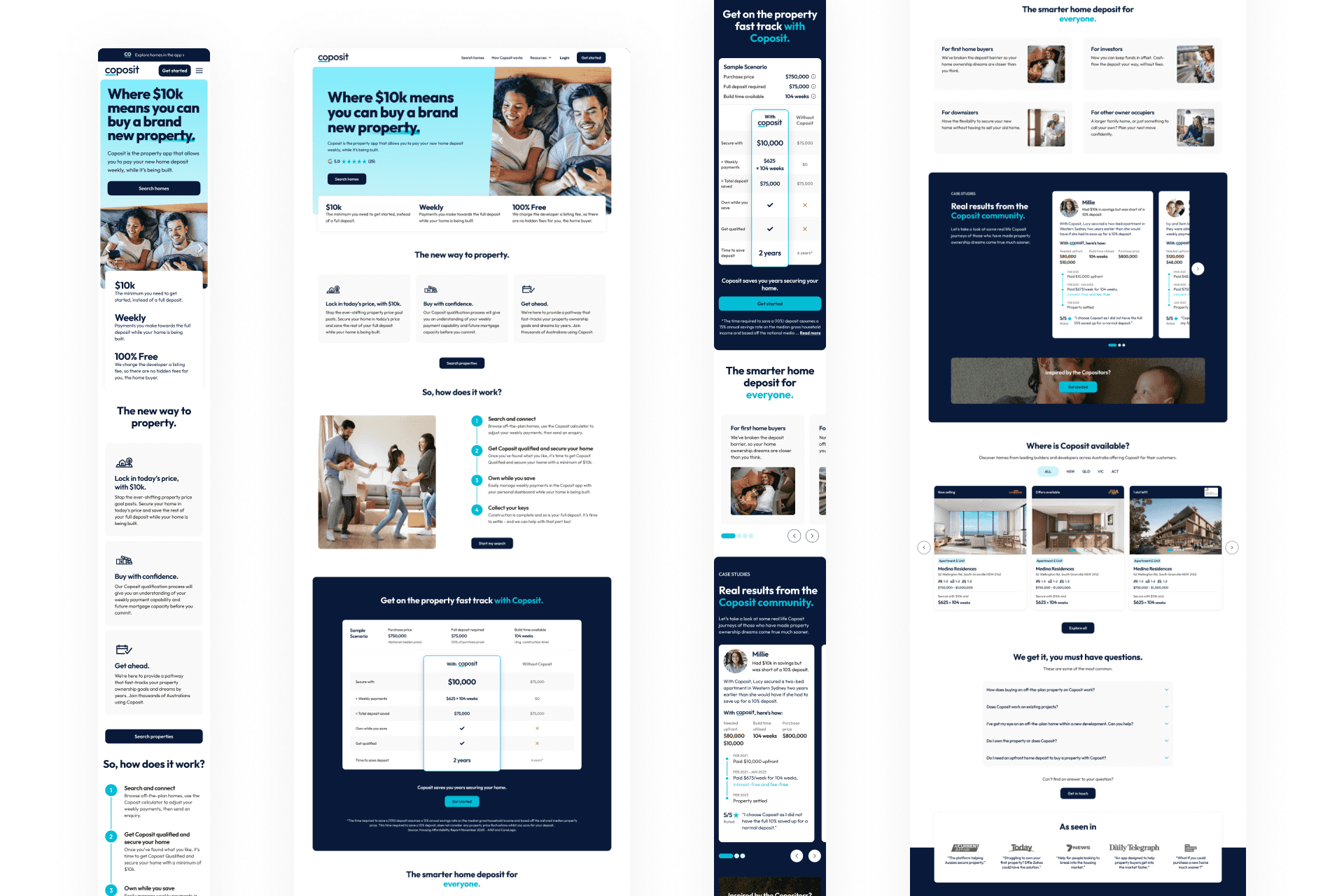
Home page redesign
Increasing the breadth and depth of content in the homepage
I started with a focus on structuring an increased number of sections as I wanted to maintain a harmonious flow of explaining Coposit while providing more details.
Image: Early stage iterations

Early testing showed positive signs
The tests involved not only the content structure and layout, but also relevant copies I've written instead of placeholders. Upon testing the iterations with a similar user group to our initial discovery, I noticed a much improved accuracy in understanding key information about Coposit. However, users felt that the "How" section was slightly harder to skim as it combined a sequence of events and a list of benefits compared to purchasing with a traditional deposit, but was missing a contextual scenario. Thus I decided to split the section, which could come at the cost of page length.
Changes made
Implemented a more organised and detailed content layout to comprehensively address users' questions and concerns.
Highlighting Coposit’s unique benefits with a clearer and more in-depth explanation of how it works.
Added case studies to provide real-world examples and build credibility.
Image: Home page UI
How might we highlight Coposit-specific details in the list page to differentiate it from other property marketplaces?
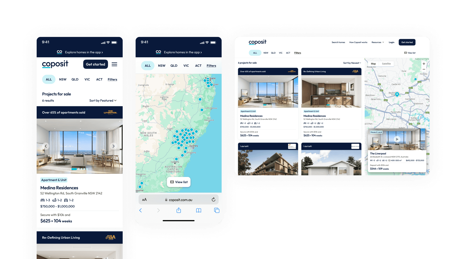
Project listings page redesign
Facelifting the project listing preview for uniqueness and readability
This was aimed at improving the clarity and readability of previewed details without compromising the amount of information shown. The weekly payments highlight section now also features the initial deposit amount, which was supposed to be Coposit's key USP.
Added map view and filters to support growing list of projects
Added map view and filters to accommodate our expanding project list and meet user expectations for browsing properties. These features enhance navigation and help users browse more efficiently.
Image: Listings page UI
How can we present project details in a more engaging and skimmable way for Coposit users?
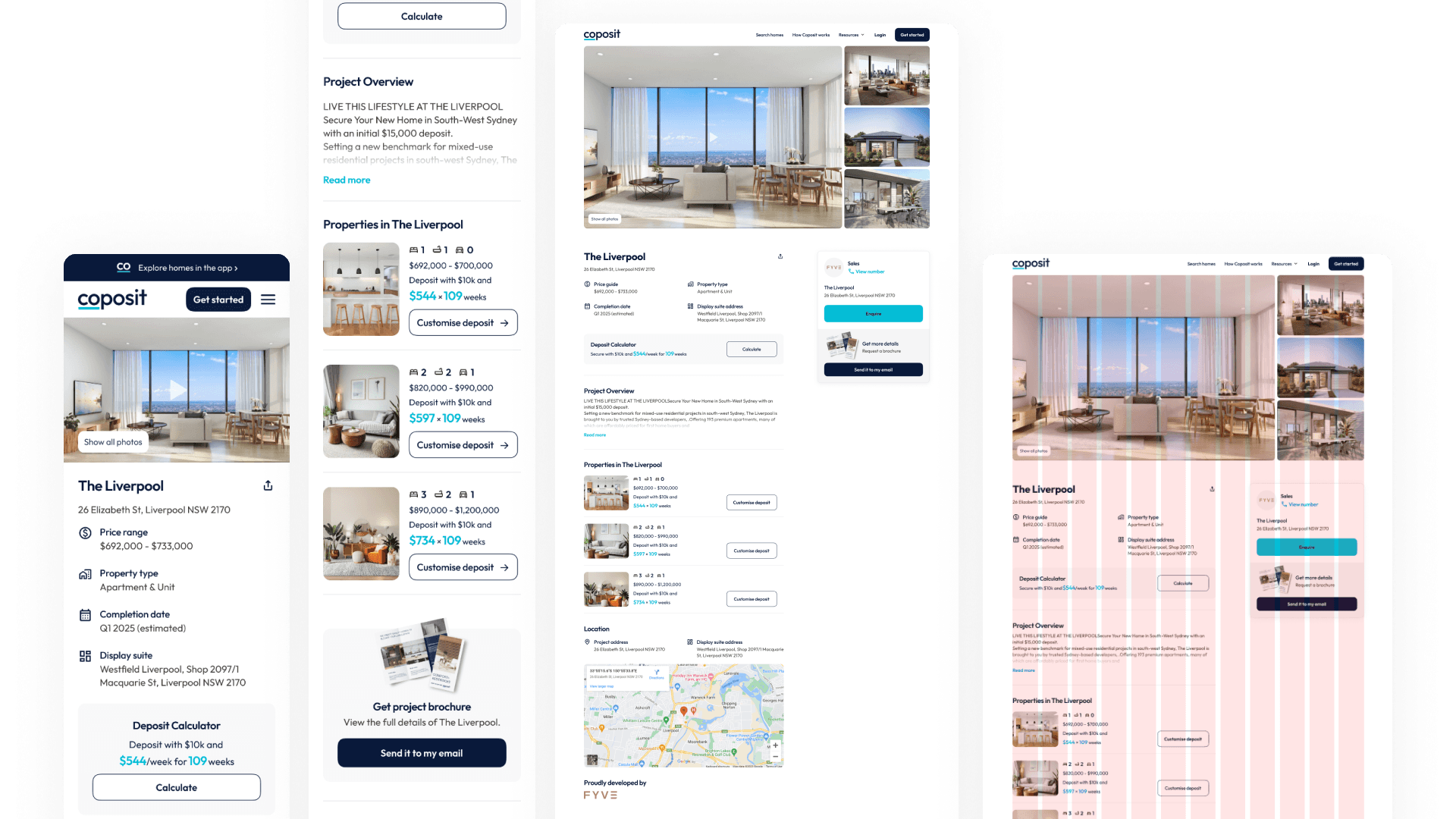
Project details page redesign
Weekly payments calculator
A calculator allowing users to instantly simulate the weekly payment amount based on the property price, number of weeks available during construction and the initial deposit they're willing to pay down.
Key points and collapsed descriptions
To give a quick overview, concise key points such as the price guide, property type, completion date and display suite address were added. Meanwhile, the description section became collapsible as viewers are unlikely to read it based on earlier research findings.
Property configurations
Previously a high volume of leads were curious about the availability of only the number of bedrooms they're after, which led to a lack of knowledge that required agents to tediously address via call or email. Thus, we decided to show all property types and their price guide with the hope that users can better evaluate their options before going through an agent and that it allows Coposit to potentially upsell early on.
OTP required to submit enquiry
Implemented an OTP verification process for enquiry submissions, reducing spam and ensuring the authenticity of potential buyers. This measure protected user data and improved the overall lead quality.
Image: Project details page UI
User testing
Goal
We wanted to see if the changes has addressed issued found in earlier insights, mainly whether they have improved the website's transparency, clarity, navigation, accessibility and trustworthiness, based on participants' understanding of Coposit and perceptions.
Method
Participants were asked to navigate the site prototype and find specific pieces of information with varying levels of difficulty, e.g.:
Easy: Find a property of interest.
Medium: Understand how Coposit generates revenue.
Difficult: Determine the weekly payment for a specific property if your initial deposit is $xxx.
Highly positive results from various cycles of testing and iterating eventually paved way for development and go-live.
Results
First ever web lead purchaser
The redesign led to the first-ever property purchase successfully converted from an enquiry on the Coposit website.
Spam eliminate
Eliminated spam inquiries, leading to a more accurate measure of genuine interest.
Conversion rate boost
Achieved a 200%+ increase in the conversion rate from unique users to inquiries.
Feedback from a recent purchaser's parent
"When my husband came home from the display unit and told me about Coposit, I was floored and could not believe it and was thinking there is surely a catch and this can't be true. I then looked at your website and it made sense to me how it all worked and I think it's really amazing"
(July 2024)