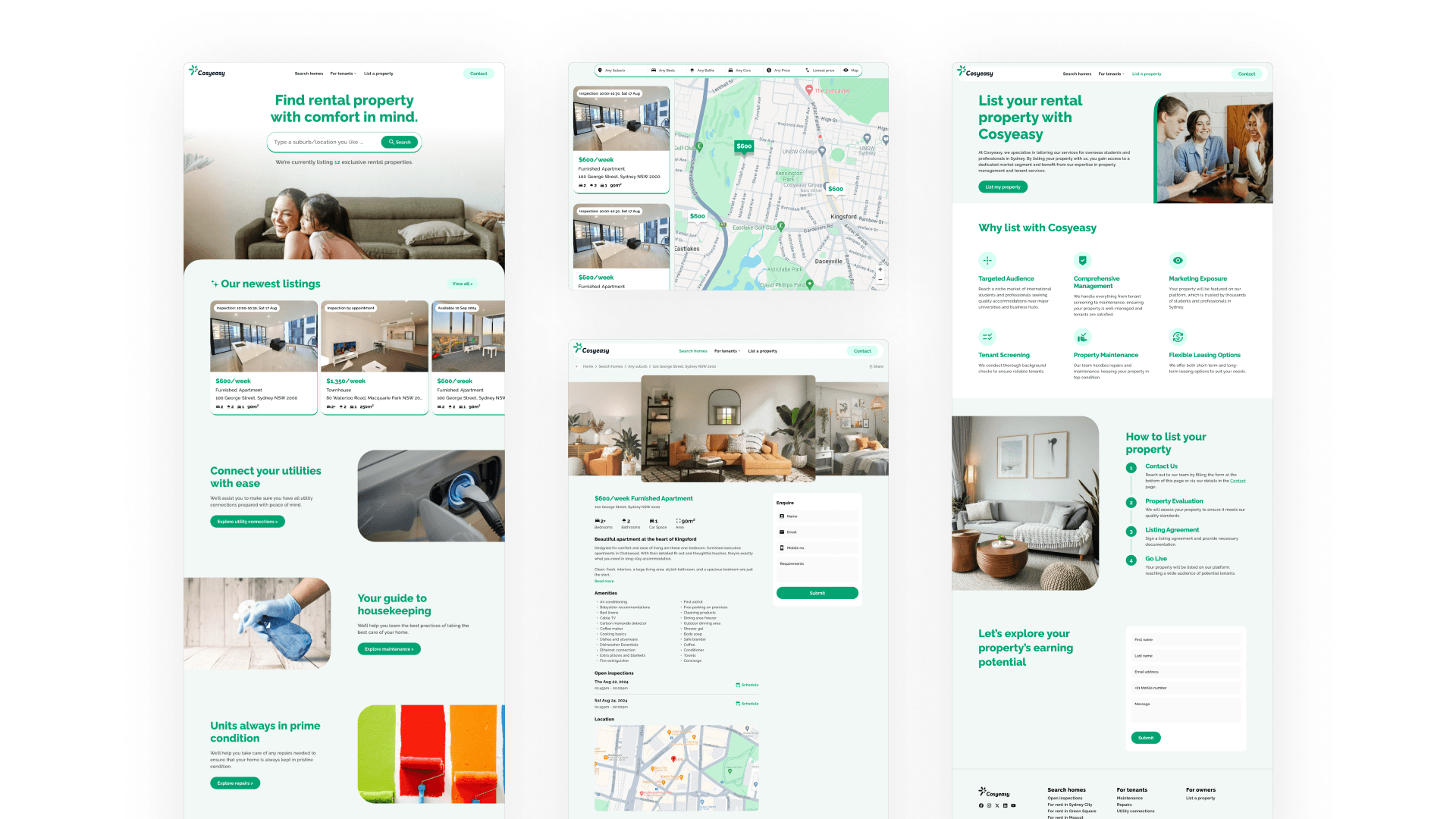
Transforming a property rental website
Cosyeasy is a property agency in Sydney, Australia that specialises in leasing apartment units to international students. To compliment their growing exposure in the international community in Sydney, they wanted to uplift their image.
Team
UX Designer (Me)
My responsibilities
Prototyping
Tools
Figma
Timeframe
1 week
Challenge
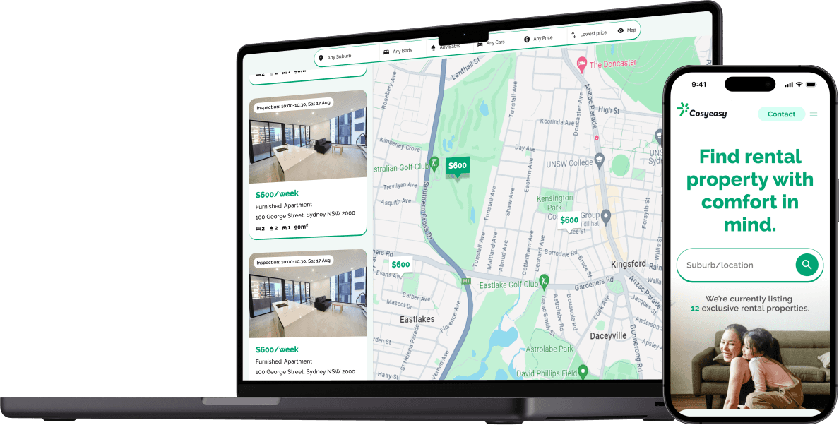
Existing feedback gathered by CosyEasy showed that the website had several usability issues, an outdated design, and lacked competitive features such as a map view. L
Moreover, landlords who visited the site - on which their properties would be listed - found the search and navigation cumbersome, while the overall visual appeal of the site to be below industry standards.
Testing the existing website with friends.
Conducted a competitive analysis of established property rental websites in Australia and overseas to identify best practices.
Studied the target audience to understand their needs and preferences.
Listing the data entities from the existing website to understand the level of transparency already provided to users, that can be succeeded.
Designed the site architecture and user interface, with continuous iteration based on internal feedback.
Cosyeasy founder highly satisfied with the output
As the website is in the implementation phase, specific results are not yet available. However, the redesign aims to achieve improvements in user engagement and conversion once the new website is launched and gains traffic.

